The punchline is that we’re rebranding. Scroll down to see the new Monday Night, or read this letter from our Co-Founder, Jonathan Baker, to find out why.
We have realized over the past couple years that change has happened to us and around us since our start in 2011. For one, the industry has changed. When we launched, the “successful brewery playbook” dictated that you must make 3 beers and 3 beers only. A dark beer, a wheat beer, and an IPA. So that’s what we did. Now, a brewery can decide they only want to sell craft lagers… or IPAs… actually, what even is an IPA anymore?
We’re now over 11 years old. When we started out, we were one of just 3 breweries in the city of Atlanta. Now, we’re one of dozens. We’re also part of a much larger, more vibrant ecosystem of craft breweries internationally.
But we aren’t rebranding just because the industry has changed. More importantly, we have changed. We have grown as people, grown in our knowledge, and grown as a brand. We just happen to be the most award winningest brewery in Southeast, and that isn’t by accident.
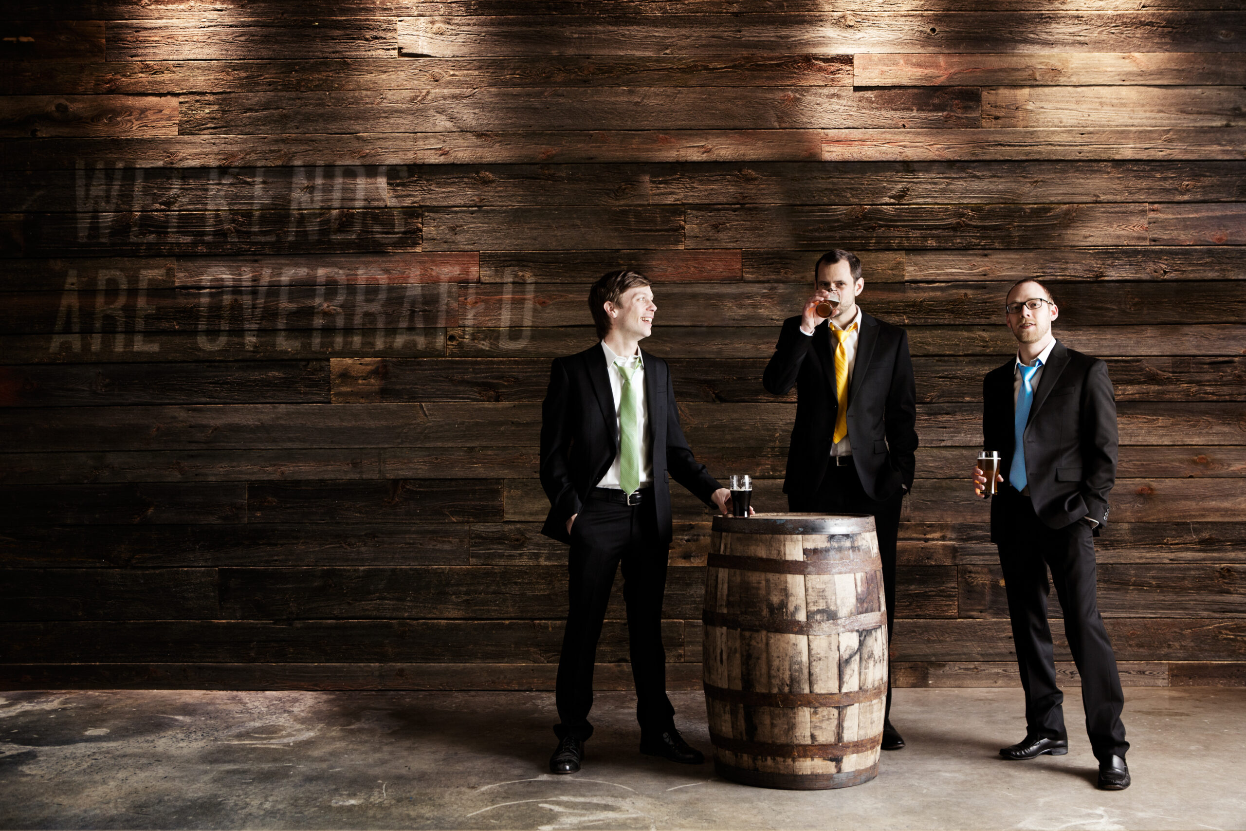
Our original logo has served us well. It’s actually a silhouette of my business partner, Joel. We were all working white collar day jobs, wearing neckties to work, making beer for our friends and family. But it’s time to “get out of the menswear business” as our design partners at Matchstic so eloquently put it.
So without further ado, we’re so stoked to preview our new logo with you.
We want to point out a few reasons we’re excited about it:
- It exudes craftsmanship and quality. The hand-drawn word mark is both intentional and human. We pride ourselves in our craft, and this feels more “craft” than our old logo, while still being quirky enough to be fun.
- It is forward looking. The slight forward slant of this logo connotes our desire to always strive for better.
- It promotes inclusiveness. This logo feels more inclusive than our necktie-wearing gentleman (no offense to Joel). We want everyone’s first interaction with our brand to make them feel like this is a craft beer for them, and we realize that such a strong “white collar male vibe” could be masking our true heart for people.
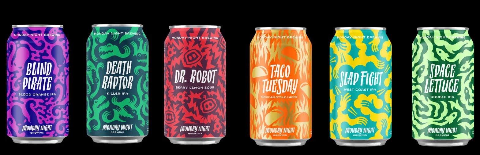
- It points to the beer, not the brand. This is an uncomplicated logo, and that’s intentional. We want the real focus to be on our beers. Simplifying our logo gives us license to give each beer more of a personality.
You can see this play out in our new can designs:
Change is never easy. We get that. As the guy who brought the necktie-loving brand into existence, this is especially hard for me. But the more I have thought about it, the more I am convinced that our logo and look needs to do a better job representing who we are as a company and how incredibly amazing our beer is.
After going through a global pandemic with amazing folks like you, we are even more excited about the future of Monday Night. We think this new look is a better reflection of who we have become, and we are excited to push ourselves (and our beer) towards even better places. We’ll be sharing much more in the coming weeks. We always say this, but we mean it: thanks for being a part of our journey. It means the world to us.
—Jonathan Baker, Co-Founder of Monday Night Brewing